Archive for September, 2009

Response #5 (Kelli)

September 29, 2009

1. McKee talks about how sound and image “combine to form one communicative event” in movies and cannot be separated by the viewer. Can you think of any examples where the soundtrack of a movie becomes as familiar as the images in the movie itself? How does this add to/change the overall movie experience?

Saturday Night Fever, Purple Rain and Superfly all have soundtracks that are both more recognizable and superior to the movies they were recorded for. This does change the experience of watching the film somewhat as I begin listening for specific songs.  I think it enhances the experience.

Discussion Questions

September 29, 2009

1. Which of Van Leeuwen components of voice (tension, roughness, breathiness, loudness, pitch, vibrato) do you feel has the greatest impact?

2. What are the differences between the senuous, expressive, and sheerly musical planes?

3. How can you make sounds compliment a piece of visual work without making it disctracting?

Respnse to Projects

September 24, 2009

Vince– Interesting use of motion.  Use of scale was an effective way to quantify the intensity of the workout. Multiple angles of same event was interesting.

Ricky–  Esoteric in a good way.  Would be effective paired with Time by Pink Floyd in the background.

Laura– Young children.  Cute kids are always an effective narrative device.

Kelli– Nice tour of campus. Effective ordering of slides makes it feel as though one is moving from one location to another.

John– A “day in the life of” narrative blended with artificial images to create a sort of fairy tail.

Joe T.– A bit cynical but not necessarily unrealistic. Would go well with Shooting Star by Bad Company in the background.

Joe C.– Might be a bit on the nose, but the song Signs by Emerson, Lake and Palmer would be appropriate background music.  There are alot of signs on campus.

Ivan– Architecture of China.  Effective contrast of traditional and modern.

Hailey– Abstract concept. Certainly more creative than anything I could come up with. Good quote.

Fred– Truly a life altering experience. Four stars and two thumbs way up.

Chris– Interesting change in tone.  Didn’t expect it turn out the way it did.

Chang– Not a problem I can personally relate to, but it gave an effective overview of a common inconvenience.

Brian– Blurry images suggest motion.

Brandon– Paths, roads and trails. Cool concept.

Bobby– Mixture of captured photos and downloaded.

Billy– Looks like fun. (I should know because I was there)

Annie– Looks a nice day.  Really clear narrative.

Andrew– Very detailed. Views at different times of day gave new multiple perspectives.

Andrei– Nifty concept. Pairs old and new.

Analise– Great concept. Fun to watch.

Project

September 24, 2009

Just click slideshow. My essay is below.

Arguing with Images

I struggled when developing an idea for this project.  My initial instinct was to do something conceptually abstract.  I hoped I could create something that would require me to give only subtle hints as to what I was thinking and leave the viewer to drew his or her own conclusion as to how the images on the screen fit together to form a narrative.  Unfortunately, this idea quickly fell through because of the fact I have neither the creativity nor the visual organization skills necessary to arrange a series of esoteric images into a narrative that is even coherent (let alone appealing).

I therefore decided to go in the complete opposite direction.  Instead of a mind altering visual journey I would give the audience a relatable story.  I decided to shield my weaknesses by highlighting a common activity that I happen to be rather good at.  In other words, I traded inspiration for simplicity and hoped that the loss of originality would be offset by gained practicality and better overall structure.

I settled on making dinner as the chore I wished to document (a decision I admit was influenced in part by to the fact that I had to do it anyways).  So I quickly formed a basic outline of what the photo essay would look like in my head and then set about creating it.

Using my camera phone (the only camera I had access to) I took pictures of all the ingredients I would be using as well as the pots, pans and utensils necessary to combine them.  I was careful to make it very obvious what I was doing in every shoot I took.  I even used pictures of a clock to show how long the shrimp needed to cook and the pasta to boil.  I also took a picture of a salad to give the audience an idea of something to do while waiting for the shrimp and pasta.

That said, I am well aware that this is not the most ambitious photo essay ever assembled.  It is however, a comparatively useful one.  As I said earlier, practicality was one of my goals with this project and that influenced, amongst other things, the dish I chose to prepare.  I decided on shrimp scampi because it is not something most college students prepare regularly and I tried to use low cost ingredients in place of more expensive fresh shrimp and herbs so that the recipe would fit into students’ budgets.  While it is quite possible (if not probable) that no one who sees this presentation will ever attempt to make this dish, they now at least have the knowledge necessary to do so.

Response #4 (John)

September 22, 2009

3. Some paintings are displayed in a weakly lighted room so the painting does not faint. But doesn’t the lighing change the way see the paintings? If it does, what is the point of visiting museums to see the original paintings?

I suspect this is a bit like the arguement about seeing a sporting event on TV versus seeing it live.  From a visual perspective, watching on TV generally gives a better perspective on the action on the field thanks to multiple camera angles and instant replay.  However, people still pay money to see a game live because the experience that comes watching the game from the stands cannot be replicated on TV.  Similarly, the expreience of seeing a painting even in a weakly lighted room is simply not the same as look at a photograph.

Discussion Questions

September 22, 2009

1.  Why do you think American society pushed for more realistic comics to the point that live action adaptations are mega-hits in the last few decades ?

2. What do the three vertices of the comic triangle represent?

3. How do you feel the invention of the camera has changed the way we perceive paintings?  Is this change for better or worse (or both)?

Stencil

September 15, 2009

img106

img103

(This was actually one image, but my scanner couldn’t fit the whole thing and none of my pictures of it came out correctly).

This image is suppose to warn of the dangers of technology.  Not in The Terminator “robots will rise up and over throw us” sense, but rather that technology can have unintended consequences.   It is intentionally over the top in a 1950s sci fi movie poster way in hopes of getting  the attention of those who see it.

Response #2 (Ivan)

September 8, 2009

2) Should graffiti that is intended to have a positive or inspirational message be viewed in the same way as graffiti that is intended to be vandalism/ public defacement?

They should be treated the same though not necessarily evaluated the same.  After all murder is murder regardless of motive (except in a handful of very rare circumstances).

While one may be more “positive” it would be better to find a legal, and less destructive, manner.

Discussion Questions #2

September 8, 2009

1.  How practical do you think the information in How to Use Your Eyes is likely to be? Is the ability to really “see grass” (or any of the other examples) likely to have the sort of profound effect on your life as the author implies it will?

2.  Do you feel the information contained in How to Use Your Eyes could actually be detrimental in some ways?  Are there somethings that when analyzed actually lose some of their charm?

3. According to Language in the Landscape in the landscape “instructive language always cheats us of an experience we might have in exploring a situation”.  Is that really a fair assessment? After all it could inspire imagination and interest in an area that might normally be ignored.

Remediation

September 3, 2009

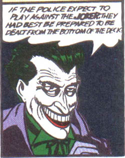
Origianal Joker

This was the Joker’s first appearance in the Batman #1

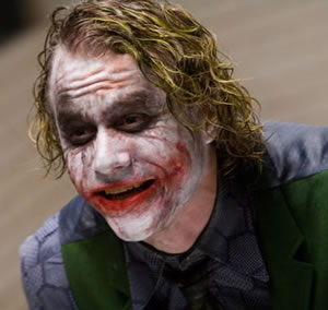
ledger-joker

This is the Jokers’ most recent appearance on film. He’s portrayed by Heath Ledger in The Dark Knight.  Notice that unlike the original comic Joker, this Jokers’ smile is the result of scaring not a deformity.  Also his white skin, cherry lips and green hair are the result of make up and hair dye not chemically altered pigmentation.